Today we’re going to take a look at 37 creative signs that will inspire your own signage project.
At AGC Signs, we’ve been in the customer sign industry for over 10 years and we’d love to share some of the unique ideas we’ve come across!
Click on the links below to jump to specific signs we’ve designed and installed.
In this article, you’ll get to see a wide variety of sign designs to help you get ideas for your commercial signs. Let’s get started!
1. colourful Bird Sign
Image Source: Simon Perrin, Park Sign, Flickr
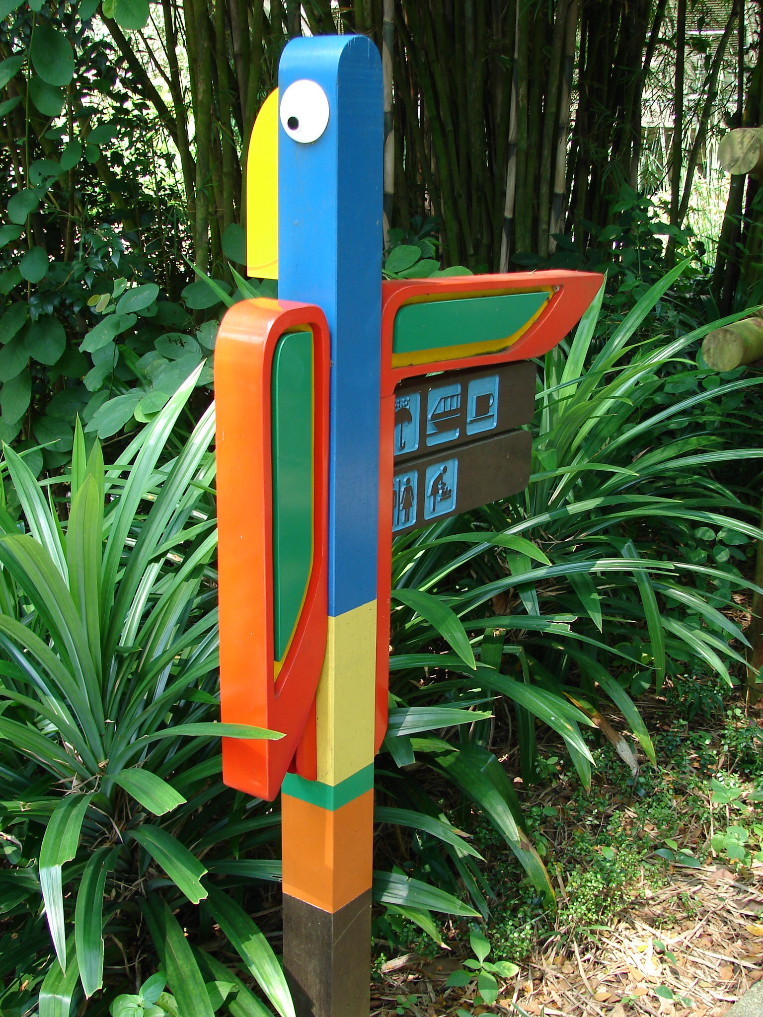
How can your eyes not be drawn to this amazing bird sign! This fun and quirky wayfinding sign uses bright colours to grab attention. Under the bird’s “wing” you can find icons that tell you exactly where to go for various amenities!
2. overlapping letters
This parking garage sign decided to forego more traditional direction signage and instead add a beautiful, vivid mural right on the brick wall. You definitely won’t have drivers confused about where they need to go in this garage.
3. shadow sign
Not all creative signs need to be elaborate. This simple sign shows just how creative you can be even with limited resources! Lettering, light, and transparency can all be design elements you incorporate into your own signage.
4. Mixed Material Monument Sign
This elegant monument sign is a great example of how mixing materials can create a unique and visually striking finished product.
In this case, the thoughtful combination of natural wood and a sleek, modern sign face results in a design that’s both professional and inviting.
The wooden backdrop adds warmth, texture, and a sense of craftsmanship, while the clean blue and white acrylic or metal faceplate provides contrast, clarity, and a polished appearance.
This blend of materials not only enhances visual appeal but also makes the sign feel grounded and harmonious with its surroundings—ideal for a school setting that values tradition, excellence, and community.
The result is a sign that stands out without being overly flashy, effectively communicating the institution’s brand in a way that feels both timeless and contemporary.
5. gorgeous silhouettes
Welcome to the neighbourhood! This amazing neighbourhood sign definitely goes above and beyond. With the perfectly crafted tree silhouettes and the see-through lettering, this is definitely a sign to remember.
6. sleek pylon sign
This pylon sign for Street Eats STC is a great example of how mixed materials and clean design can create a bold, modern look.
The matte black sign face contrasts sharply with the light-colored posts, making the white logo stand out clearly and ensuring strong visibility from a distance.
The combination of smooth, contemporary materials with more traditional surroundings—like the stone pillars nearby—helps the sign blend into its environment while still looking sharp and professional.
It strikes a perfect balance between trendy and approachable, making it an ideal fit for a food-focused venue. This is a great example of how thoughtful material choices can turn a simple structure into a standout branding piece.
7. rustic business sign
Image Source: SperoMetalWorks on Etsy.com
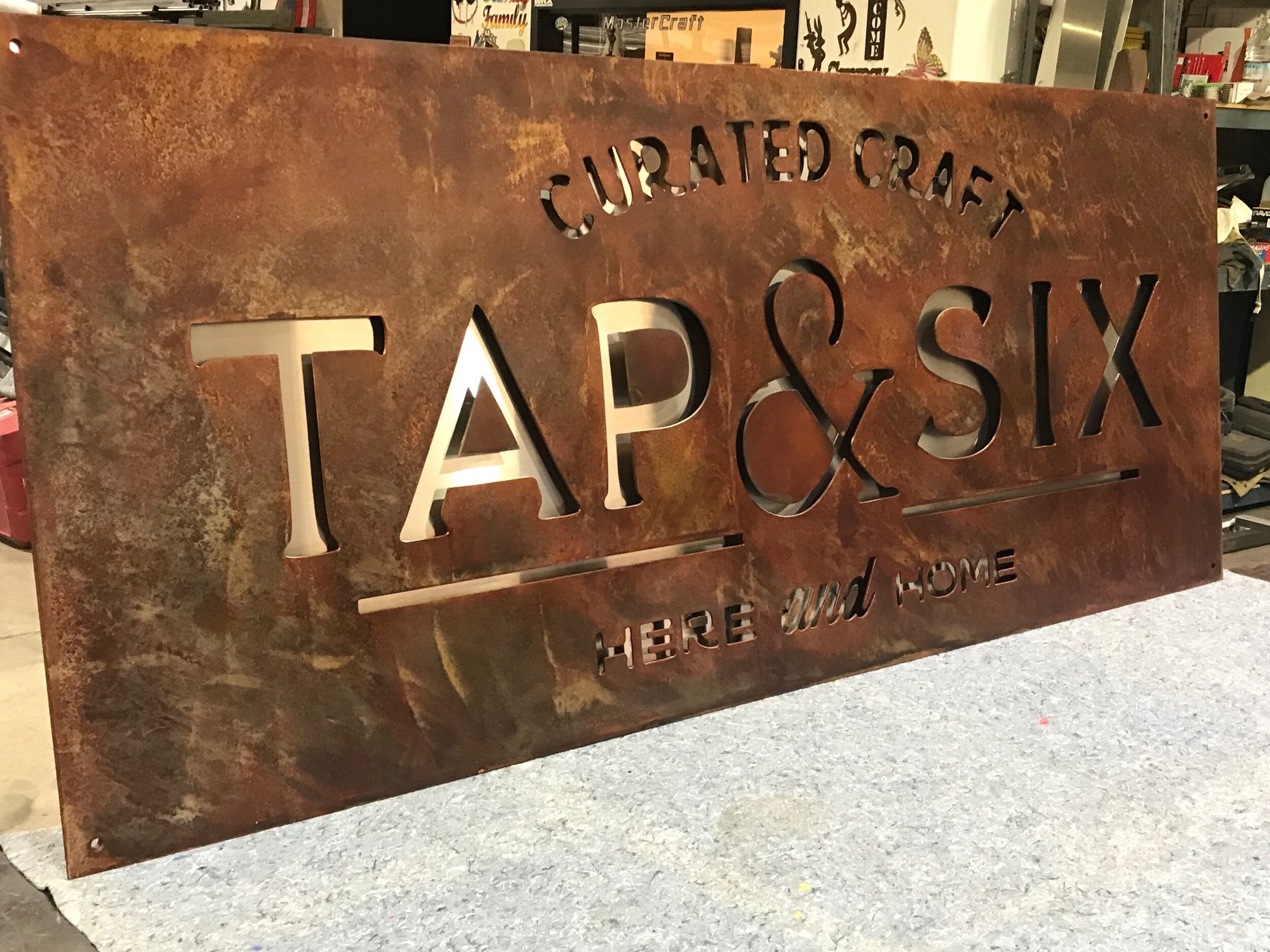
In contrast to our modern design above, this creative rustic sign is sure to grab attention! Bars, cafes, antique stores, and other small businesses may benefit from rustic signage. This sign shows you can go rustic and still look professional.
8. informative construction hoarding
Construction hoardings are often overlooked when it comes to signage, but they play a surprisingly important role in both branding and public engagement. Far from being just a barrier around a job site, a well-designed hoarding can serve as a powerful storytelling tool—offering a glimpse into what’s to come while building anticipation and interest in the final project.
Take this example of ours: rather than leaving a plain or branded wall, they’ve turned the hoarding into an engaging, museum-style experience.
As pedestrians walk past, they’re treated to bite-sized pieces of information, visual previews, and narrative elements that make the space feel thoughtful and intentional. It transforms an otherwise disruptive element into an informative and even enjoyable part of the streetscape.
In this way, hoarding signage becomes a temporary yet valuable marketing platform. It can educate, tease future developments, or share the values behind the project—all while maintaining site safety.
When used creatively, construction hoardings leave a lasting impression long before the doors of the new development even open.
9. vivid imagery
Image Source: Pinterest.com from Letterheadfonts.com
Your sign doesn’t have to consist of simple, plain letters if you want something more! This business sign uses unique lettering as well as full-colour images to create a beautiful, creative sign design.
10. natural sign
Image Source: Hammerheadstoneworks.com
Another unique neighbourhood sign, this one also uses mixed materials to create a natural and welcoming look. The two large, natural boulders are incorporated on each end of a masonry base. The “Ironwoods” part of the sign is beautifully crafted from metal - showing another great example of mixed material signage.
11. Fun Window Display
If you’ve been to the mall recently, you’ve likely noticed a variety of eye-catching window displays.
While they may not fit the mold of traditional signage, window displays are a vital part of retail communication and branding. They do more than just show off products—they draw people in, tell a visual story, and help define a store’s personality at a glance.
For businesses located in malls or shopping centres, window displays act as your first impression.
They can showcase promotions, highlight new arrivals, or align with seasonal themes—all while reinforcing your brand’s identity. Think of them as a silent salesperson working around the clock, attracting foot traffic and setting expectations before a customer even steps inside.
If you're in a retail setting, consider how your window display can be used strategically as signage. With the right design, it can boost visibility, drive curiosity, and ultimately lead to more conversions.
12. Library Wayfinding Sign
If you have a big office or building, wayfinding signs are important for customers or visitors! Though wayfinding signs are practical, they don’t have to be boring. This attractive and creative sign shows that you can help your wayfinding signs really stand out with the right design choice.
13. themed parking sign
Image Source: Thecarvingcompanyonline.com
This parking sign shows that even the smallest signs can still be unique! If you’re looking for inspiration for smaller smalls on your property, consider adding a small image or icon. Also, consider the colouring and font choices - all of which can influence the overall look of your sign. The colours, picture, and font choice of this sign all work together to create a nautical look.
14. building sign
This awesome restaurant sign is painted right onto the building. This is fairly common with cafes and restaurants, but this sleek and modern sign shows just how awesome it can look. These signs shouldn’t replace storefront signage (which can light up at night), but works perfectly in addition to other signs.
15. modern bathroom signs
Image Source: GraySkunk on Etsy.com
Can bathroom signs really spark inspiration? Although we may not think about exit signs, bathroom signs, door signs, and other ‘small’ signs around businesses, they are just as important as larger monument or storefront signs! These attractive bathrooms signs are a good reminder that even the smallest signs should be thought of when planning your company’s signage.
16. Adidas Pathway
This Adidas signage makes creative use of the stripes in their logo by using them to create a pathway of sorts into their store! If you have a unique logo or element you want to emphasize, take note of this design.
17. simple logo in lettering
Don’t be afraid to get creative with your lettering and logo! This sign for York Racquets Club is a perfect example of how a small design tweak can make a big impact.
By cleverly turning the “O” in “York” into the shape of a racquet, the sign instantly communicates what the business is all about—without needing extra words or explanation.
It’s clean, minimalist, and highly effective. This kind of visual pun not only makes the logo memorable but also adds a touch of personality and fun.
When designing your signage, think beyond just fonts and colors—look for ways your lettering or logo can visually reinforce your brand or services in a smart, unexpected way. A little creativity can go a long way in making your business stand out.
18. elegant awning sign
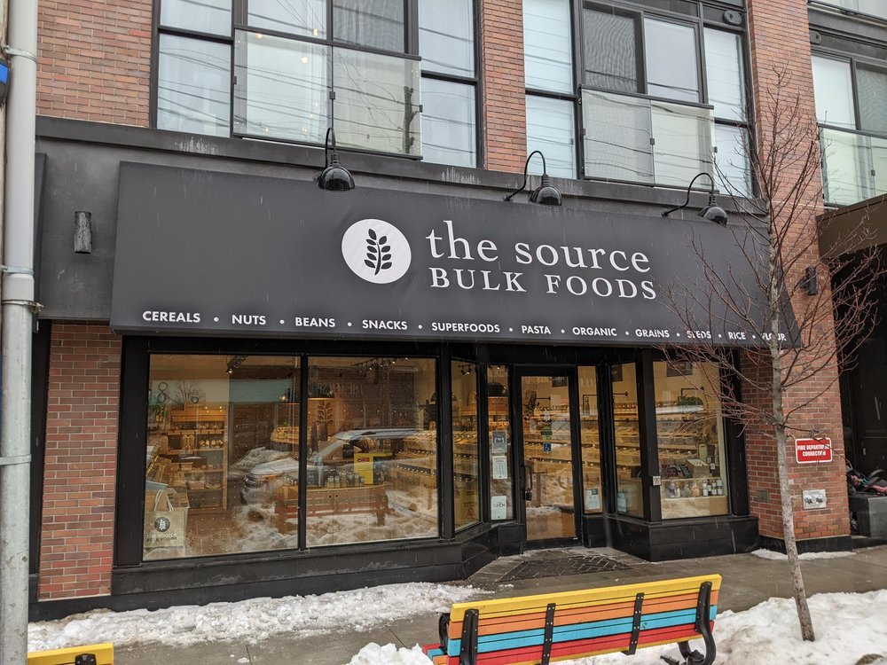
Awning signs are a popular choice for boutiques, cafes, and small businesses because they blend style and function—offering shade, branding, and street presence all in one. This example from The Source Bulk Foods shows how effective an awning sign can be without relying on bold colors or oversized lettering.
The black-and-white color scheme is clean and understated, letting the minimalist logo and serif typography do the talking. Instead of shouting for attention, this design draws you in with its simplicity and balance. The text along the bottom of the awning clearly communicates the product range, giving passersby a quick snapshot of what’s inside.
This sign doesn’t just advertise—it reflects the brand’s identity. It’s earthy, modern, and approachable, making it perfectly suited to a store focused on healthy, sustainable foods. When designing your own awning sign, consider how the shape, color, and layout can all work together to quietly reinforce your brand, just like this one does.
19. multi-tiered storefront sign
Another rustic storefront sign, this stylish and trendy sign perfectly matches its surroundings - and looks great too! Your signage can convey a lot about your business, simply from the design. This elegant and rustic design looks straight from Pinterest, and works perfectly as a sign for a wedding company.
20. retro motel signage
Creative signs come in all shapes and sizes! We’ve looked at a lot of modern designs, but what about learning from signs of the past? This awesome retro motel sign is absolutely amazing, with its colours and thunderbird soaring right through the lettering.
21. creative floor sign
Interior signage is just as important as exterior signage. This big and bold sign lets visitors know exactly what floor they’re on - you definitely won’t need to guess where you are when you walk through those doors.
22. fun farm sign
This awesome monument sign by Northwest Sign & Design shows just how creative you can be with your signage. A monument sign doesn’t have to be a simple slab of wood or steel - you can incorporate any type of design you want - including a cute little animal friend!
23. stand-out Donor Wall
This donor wall is a fantastic example of how signage can go beyond function to create a sense of pride, community, and celebration.
Designed for a Centennial Endowment Campaign, the display is visually striking and emotionally impactful. Each donor name is given its own raised plaque with colorful edges, adding dimension and vibrancy to the overall composition. The consistent block format creates cohesion, while the varied colors add life and draw attention.
The use of bold, 3D lettering for the campaign title and tagline—“Our Promise • Our Children • Our Future”—further reinforces the mission and values behind the campaign. It communicates gratitude and permanence, reminding everyone who passes by of the people who helped make the project possible.
This type of signage serves as both recognition and inspiration. It’s not just about listing names—it’s about telling a story, building connections, and showing what’s possible when a community comes together.
If you’re planning a donor wall or recognition feature, this is a great example of how thoughtful design can elevate the message and deepen its impact.
24. Office Signage
This interior office sign for JA Physio & Wellness Centre is a great example of how clean, professional signage can elevate a space and reinforce your brand the moment someone walks through the door. Mounted on a deep navy feature wall, the crisp white and yellow logo stands out beautifully—creating a polished, welcoming first impression for clients.
The 3D lettering adds a layer of sophistication and dimension without overwhelming the space, while the thoughtful use of color and font conveys a sense of calm, care, and credibility—key values for any wellness-focused business. The placement of the sign, centered between two modern light fixtures, also adds symmetry and balance to the room, contributing to an overall sense of professionalism and trust.
Office signage like this does more than label a space—it reflects your identity, builds client confidence, and helps set the tone for the services you provide. Whether you're in healthcare, finance, or any service-based business, a well-executed interior sign like this one can go a long way in enhancing your environment and brand.
25. unique lights
Many signs use lights to help make them more visible during the dark and to help them stand out better. This sign definitely has a unique take on lighting! It’s a great reminder that you can use lights in different ways to help get that creative sign you’ve always wanted.
26. Gorgeous Museum Sign
This creative sign has the perfect look for a museum! When choosing a sign, remember your audience. This sign has an antique look and such a unique style that many tourists will likely want to take photos with the sign itself!
27. trendy cube sign
If your business is located in a busy downtown area, it can be difficult to find a storefront sign that lets visitors know who you are from different angles. However, this sign does just that! If you’re located on a corner, consider a design like this modern cube sign!
28. full wall mural
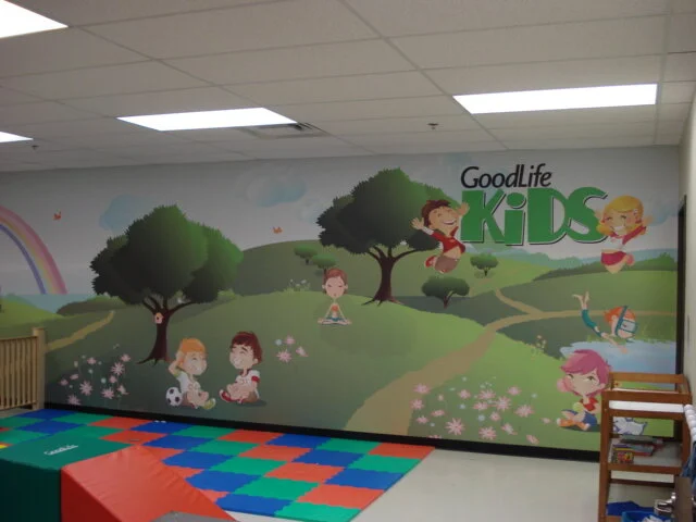
Need creative signage for a daycare, school, or children’s play place? A full wall mural is the perfect solution.
Murals have the power to transform a space—turning blank walls into vibrant, engaging environments that spark imagination and joy. For kids, that could mean colorful animals, playful characters, or nature scenes that make learning and playtime even more exciting.
But murals aren’t just for children’s spaces! They can add personality and purpose to almost any type of business.
From calming nature backdrops in wellness clinics to bold graphic art in offices or gyms, a mural can help tell your brand story, set the mood, and create a memorable experience for visitors. With custom artwork, the possibilities are endless—and the impact is lasting.
29. pallet sign
You can still create an attractive sign on a budget. Do-it-yourselfers have come up with many creative ways to use pallets, and this rustic sign is quaint and gets all the important information across to their guests.
30. hotel directory sign
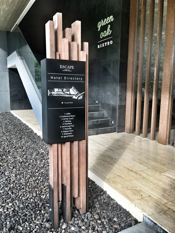
Something as simple as staggering pieces of wood is enough to give this sign a unique look that helps it stand apart from the rest. It can be easy to miss directory signs, especially in large buildings like a hotel. However, a creative sign will help ensure guests don’t have that problem!
31. creative use of symbols
Wayfinding signs are extremely important to ensure your customers or visitors know where they’re going as they enter your business. Though they are practical, this is a good example of how a sign can actually become a statement piece.
32. wraparound office sign
Simple office signage with a twist! The positioning of your signage can have a big impact. When designing your sign, consider where you plan to place it and how it will look against any walls or backdrops.
33. window lettering
Window lettering is an effective form of signage often used for retail stores, cafes, and restaurants. This witty sign uses the letter positioning to get their message across - and it works quite well!
34. decorated arch
Your storefront sign doesn’t have to be limited to the space above your door. This stunning example from Tiffany & Co. uses bright, winter-themed signage to create a full archway around the entrance—transforming the storefront into an eye-catching experience.
Not only does the illuminated display draw attention from afar, but it also adds a festive and luxurious touch that aligns with the brand.
This approach is especially effective in Canadian winters, when it gets dark early and extra lighting can help your business shine—literally and figuratively.
Creative exterior signage like this doesn’t just attract customers—it creates a moment worth remembering (and photographing!).
35. full-size menu
Cafes usually have a menu on display - so why not make it a unique part of your restaurant design? This awesome full-wall menu shows that you can get really creative not only with your sign design, but also with what you choose to communicate with your signage.
36. funky floor design
We are used to seeing signs above our heads, but signage is - and can be - everywhere. This colourful floor signage helps lead visitors into a seating area. And if you look closely, you’ll see the design actually creeps up the wall at the very back of the room!
37. “explore”
Another great example of signage placed in a less traditional location, this sign is only visible from the bottom of the stairs and is the perfect look for an educational institution.
Get The Best Creative Signs With AGC
No matter what type of sign you’re looking for, AGC Signs can help you get the perfect sign for your unique business.
We are a full service signage company, which means we’re with you from the beginning until the end. We help you design, create, and install your sign and help with maintenance down the road.
If you are ready to get the perfect sign for your business, contact AGC Signs today!
