In this blog, AGC Signs has provided a guide on how to create sign graphics. This is important for readers who might want to install a sign for their business. We’ll walk you through important factors to consider, such as:
We’ve also included a section called Help From AGC so you can find out more about our services and the support available to you when completing your sign project.
Remember, your time on quality design equals effective, long-term signage.
Your Guide to Creating Sign Graphics
Below we have prepared a guide to help business owners create effective sign graphics. Here are some factors to consider and some important questions to ask yourself along the way. To learn more you can also consult our other blog posts, 4 Essential Tips for Signage Design and Essential Sign Design Tips.
Before you invest in signage, reflect on your target audience. (Image Source: Clay Banks)
1. Your Audience
Before you settle on your sign graphics, reflect on the answers to these questions:
Who is my target audience?
Who is my typical customer?
What sort of customer does my business appeal to most?
You need to figure out who your sign is trying to appeal to before you begin designing your sign.
How old are they?
Where do they live?
What do they have in common?
Learn more about determining your target audience in the blog, Steps to Find Your Target Audience.
If you already have a couple of designs in mind or you are tweaking your current signage, you might want to do a quick survey of your current loyal customers to find out what sort of font styles, colours, or symbols they find attractive. After all, you want to select design features that suit your clientele.
Remember, AGC Signs is experienced in graphic design and can help you determine how to best capture the attention of your audience with the design of your sign graphics.
This sign is easy to read because of the font style and colour combinations.
2. Important Design Features
Some of the most important design features to consider for your sign graphics are:
Readability
Contrast
Uniqueness
Here are some tips about adding these features:
Readability
Here are some ways to make sure that your sign graphics are easy to read:
Limit your word count and keep it simple
Use an optimal amount of white space around your font and other sign graphics
Avoid highly embellished font; clean and straight lines are easier to read
Keep in mind that some people will be reading your sign from afar or while travelling, so they don’t have much time to read your sign unless they are walking by and are able to stop. Also, adding white space creates balance and is essential in helping the eye focus on the main elements of your sign.
This sign is very legible because of the designer’s choice of font and high-contrast colours.
Contrast
In order to make your text and sign graphics stand out, use high-contrast colours. These are colour combinations that appeal to the natural eye. For example, you can try the following:
Light objects on a darker/coloured background OR
Dark/coloured objects on a lighter background
As you can see in this blog, we’ve got dark print on a light (white) background. If your scroll up to the top of this blog post, you’ll also see the AGC logo uses light font on a dark background. Both are high-contrast colour combinations that help the graphics stand out. Take this same inspiration and apply it to your sign!
Uniqueness
In a world where everyone is trying to get your attention, it can be hard to stand out. Try making your sign unique in some way. You can try these ideas:
Use a play on words
Add a shape or number in place of a letter or word (e.g Fit 4 Less)
Involve humour or wit
Just don’t lose your overall message while trying to stand out. If you want some design tips to make your sign graphics more unique, AGC Signs can help.
This is a monument sign that is designed to welcome visitors to town and is built to last.
3. Other Practical Matters
Don’t forget to be practical when you design your sign. You want a sign that will:
Serve its purpose
Reflect your budget
Be sturdy and durable
Let’s look at this in more detail below.
Purpose
Before you complete your sign design, think about all the types of signs there are. AGC has all sorts of sign ideas with suggestions about when it is appropriate to use them. For example, your way-finding signage will look completely different than the storefront sign that sits above your door and is illuminated at night.
Do some research and learn about the different signs available to you.
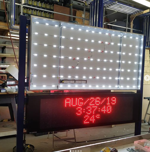
Remember that special features like digital messaging cost more.
Budget
The amount your sign will cost will depend on the type of sign you choose. A sign will generally cost more if it involves any of the following features:
Illumination
Digital Messaging
The larger or taller the sign, the higher the cost. Monument Signs or Pylon Signs require special equipment for installation and high-quality materials that ensure the sign will not become a safety hazard.
You can learn more about the cost of signs in our blog, How Much Does a Business Sign Cost? You can also contact us to get a competitive quote.
Durability
We’ve implied this already, but you want your sign to be sturdy. Investing in high-quality sign materials ensures that your sign will last longer and will require less maintenance overall. Your average high-quality signs are made from materials like:
Aluminum
Acrylic
Plexiglass
Larger signs are going to involve even more durable materials. For example, a Pylon Sign will have a foundation or base made from concrete, and a Monument Sign may incorporate stone or brick. This will cost more but will last longer.
Help From AGC
AGC’s expert team can assist with the design of your sign graphics. Along with the design, they also handle:
Working with us is a great option if you don't want to work through all the difficult logistics yourself! We’ll even help you figure out and obtain the permits required for your project.
View our gallery of work here or read some testimonials. Better yet, contact us and we can discuss your sign design ideas!
“Adrian and his team are very professional, reliable and easy to work with. AGC has made two signage for me already for two different store fronts. I love both of them! Highly recommended!”
“Over the last few years AGC Signs has consistently delivered on their promise of printing and custom design for our events. From, sponsorship signs and banners to digital signage, Rhonda, Adrian and their team created professional event signage. Thank you.”


