Today we'll give you some helpful tips on how to choose the best signage for storefront.
At AGC Signs, we have over 10 years of experience in helping companies get the right signs for their business. We’d love to share what we’ve learned with you!
In this article, you will discover the different types of storefront signage that are available, what they are perfect for, what to consider when you are designing your signage, and how to choose the best company to work with. So, let’s get going!
Discover tips for getting the best signage for storefront
Signage for Storefront
Every business needs the perfect storefront sign. A storefront sign lets potential customers know where you are and what you do. When used in conjunction with your interior signage and graphics, it also helps to promote your brand image.
A clean, attractive, and eye-catching storefront sign can also highlight the professionalism of your business.
There are a wide variety of different types of storefront signs including back-lit, non-illuminating, pin-mounted letters, channel letters, or mounted over the storefront as a light-box.
There are many different types of signage for storefront
Tips for Choosing the Best Signage for Storefront
Tip #1: Choose the Right Type of Sign for Your Situation
There are many different types of storefront signage. You want to make sure that you are installing the right type for your situation and needs. Here are some examples:
Install Monuments and Pylons for Hard-to-See Locations: If your business is set back from the road or is hidden from sight, a monument or pylon sign can be placed at the entrance or at the road in front of your location. This will indicate to passing traffic where you are located and it will also let them know what your company does.
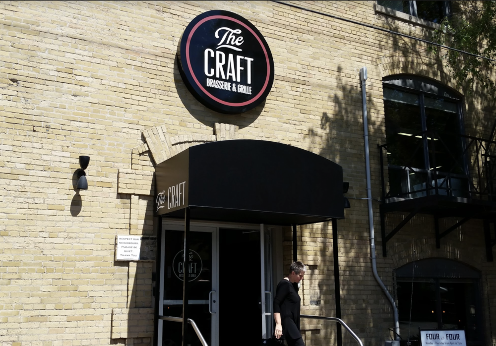
Add Awnings for Your Restaurant: An awning is a great addition to your restaurant storefront signage. Not only will it protect your clientele from the sun, rain, and snow, but they can also be used to provide shelter to an outdoor patio. Don't forget to include your branding on your awnings to complement you other signage.
Awnings provide protection for your customers
Banners for Special Events & Sales: Hang up banners on your storefront when you are having a special event or sale. This will ensure that customers know about them, thus increasing your traffic during these promotions.
Illuminated Signs: An illuminated sign is a great choice for the front of your restaurant, especially if your restaurant is open at night and you want potential customers to find you easily. It can also be helpful if you are located in a darker corner or if you want to stand out from the other businesses around you.
Tip #2: Keep It Consistent with Your Brand
Promoting your brand is a great benefit of your signage for storefront. In order to promote your brand properly, you need to be consistent with your signage.
It helps to work with one signage company who knows your brand and will be able to design any type of signage you require. This can be anything from your exterior signs to your interior, banners, awnings, vehicle wraps, and window graphics.
Keep all of your signage consistent with your branding
Tip #3: Don't Forget Your Windows
When choosing your signage for storefront, don't forget that you have a huge canvas to use with your windows. Window graphics are a great way to complement your storefront signage and they are relatively easy and inexpensive to change from time to time.
Tip #4: Make It the Right Size
With storefront signs, size really does matter. Larger letters are just easier to read. If you want your storefront signs to be seen from a greater distance, make them as large as possible.
According to entrepreneur.com, "a good rule of thumb might be 10 feet per inch of letter height." This means that if your text is 20 inches high then it can be viewed from 200 feet away.
Make sure your signage is large enough to be seen
Tip #5: Make It Legible
You need to make sure that people can read your storefront sign. This may seem like an obvious point, but it is very important to remember. If you want your sign to be noticed by passing traffic, it will need to be read in just a few seconds.
Often businesses choose signs with unusual and extremely fancy fonts that may look beautiful but are almost impossible to read quickly from a distance.
Here are some important tips to make sure that your sign is legible:
Make sure you choose an easy-to-read font
Stay away from elaborate cursive fonts
Make sure the lettering is well-spaced in between each letter and not overlapping or too crowded.
Don't overuse capital letters - Sentence or Title case is actually easier to read than ALL CAP
Leave enough “white” space around words and images
Make sure your signage is easy to read
Tip #6: Consider Your Audience
When designing your storefront signage, consider your target market and choose a sign that is going to appeal to them. Here are some examples of possible target markets and how you can design signage for storefront to speak to them:
Families: If you are targeting families or children, choose bright colours with cute or fun logos. Children are attracted to playful colours and images. If it looks good to them, they are going to convince their parents to take them there.
Sophisticated Adult Market: If you are going after a more grown-up market, then you will want to choose a design that is simple yet elegant. It should be one that provides a more sophisticated, 'adult' feel.
Environmentally Conscious Market: If you are targeting a market that is very concerned about environmental issues then make sure you choose a design and images in greens and earth tones that celebrate the planet.
If you are targeting families, choose fun colours and designs
Tip #7: Choose the Right Colours
Choosing the right colours is an important part of your signage for storefront design. You will want to choose colours that represent the atmosphere of your establishment and align well with your brand. You also want to pick colours that are highly visible.
For example, red is a popular colour for restaurant signage as it grabs people's attention and actually makes them feel hungry.
Orange is also a great choice as it combines the effects of red plus the feeling of happiness and warmth. It also gives the impression of affordability, so it would be a good choice for a business that is targeting families on a budget.
On the other hand, if you have a more upscale business, then purple may be a good choice as it evokes sophistication and exclusivity.
If you want to promote your business as being trustworthy, then blue is a great choice as it promotes a sense of confidence and loyalty. It is a good choice for medical, educational, and financial establishments.
The colour blue promotes a sense of confidence and loyalty
For the Best Signage for Storefront, Choose AGC
You can trust AGC Signs to manufacture and install any type of storefront signage your business requires.
We have over 10 years of experience in the signage industry in Ontario. All of our technicians are highly skilled and extremely hard-working, and we use only top-of-the-line equipment.
You can trust us to do the job right; we do all the work ourselves and never subcontract it out. Contact us today for a quote.
““I wanted to thank you AGC and staff for their excellent work on my outdoor windows vinyl design and installation. They were very communicable, efficient, professional, and perfect for the project. I operate a moderate size venture in south Ajax and recommend them confidently.” ”


