Today we’re going to take a look at 13 of the top reception signs that will improve your office space.
At AGC Signs, we’ve been in the customer sign industry, serving customers all across Ontario, for over 10 years and we’d love to share some of the unique ideas we’ve come across!
In this article, you’ll get to see a wide variety of office reception sign designs to help you get ideas. Let’s get started!
13 Top Reception Signs
We’re counting down the top 13 reception signs so let’s see which ones made the list and why.
1. Contrasting Colour
Image Source: AGC Signs
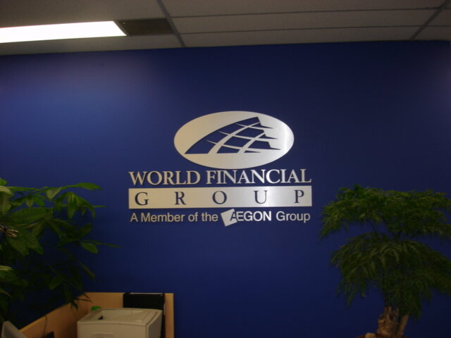
The colours you choose for your reception area can completely transform the look, feel, and perceived professionalism of your space. In many cases, colour is the first element that catches a visitor’s eye—before they even read the words on your signage. It sets the tone for your brand’s personality, influences mood, and can subtly communicate qualities you want associated with your business.
For example, bold, saturated tones like royal blue convey feelings of trust, stability, and dependability—traits that are especially important in industries like finance, healthcare, and professional services. Pairing these colours with high-quality materials elevates the effect even further.
This reception design, featuring a shining metal cut-out sign and precision-crafted letters by AGC Signs, demonstrates this perfectly.
The metallic finish reflects light beautifully, adding a touch of luxury, while the deep blue backdrop serves as a confident, calming foundation.
Together, the combination creates a striking contrast that draws attention, communicates authority, and leaves a lasting positive impression on clients and visitors alike.
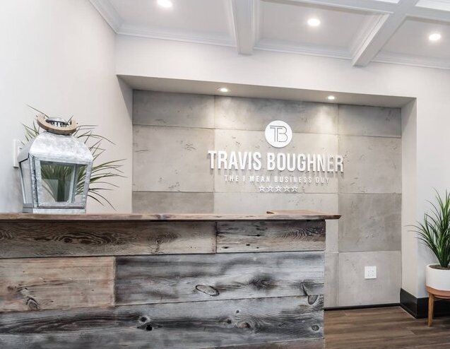
2. Office Logo Art
Use your office signage not only to promote your brand but also as beautiful decor for your office reception area. This lovely logo by Adam Gunn is a great example of a beautiful piece of artwork.
3. Spa-tacular
Image Source: CitySearch.com
Sometimes less is more as with this beautiful space reception area from Skin Perfect Aesthetics.
The choice of having simple white lettering works really well and adds an extremely calming effect to this area, while still letting the customers know where they are.
4. Don’t Forget the Desk
Image Source: ArchDaily
Creatively locate reception signs on the front of your reception desk as well like this one in Adriana Garcia’s dental office.
The attractive fonts and soft colours in the logo give a very soothing feel to the space, which is exactly the mood you want to set for a dental practice.
5. Flower Power
Image Source: AGC Signs
Don’t forget that your reception area isn’t limited to just the desk or the wall behind it—every wall in your office has the potential to tell your brand’s story. Too often, side walls and open spaces are left bare, missing a valuable opportunity to make a visual impact.
One way to maximize these areas is by incorporating giant wall murals that combine striking visuals with your brand messaging. These can range from abstract patterns to high-resolution photography, or, as in this example, vibrant floral designs paired with tasteful, well-placed text.
The flowers and lettering, manufactured by AGC Signs, instantly transform what could have been an overlooked wall into a stunning focal point. The scale of the mural draws visitors’ attention from across the room, while the customized text reinforces your company identity and values.
This approach not only elevates the overall aesthetic but also creates a cohesive, immersive brand experience from the moment someone walks through the door.
6. Purr-fect Reception Signs
Image Source: North Woodbridge Veterninary Hospital
We like how these 3D reception signs at the North Woodbridge Veterinary Hospital are a simple yet eye-catching design. The colours pop against the neutral background and the images are playful yet very appropriate for the space.
7. Branding Beautifully
Image Source: AGC Signs
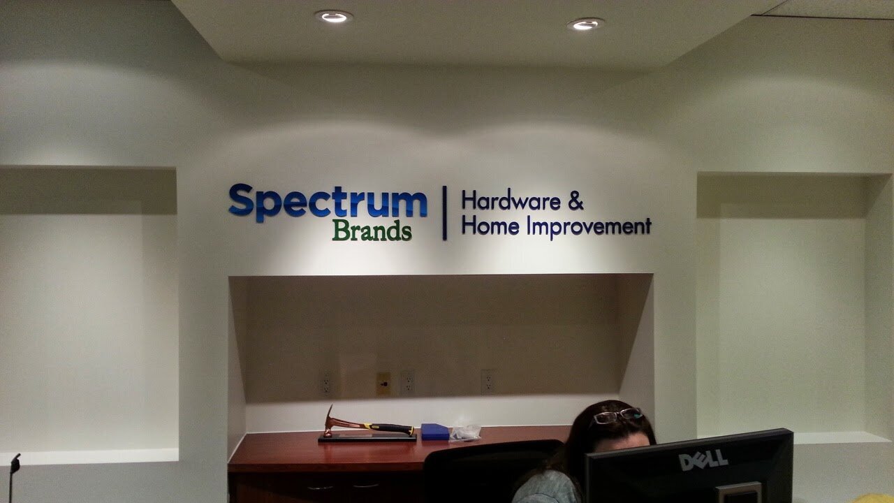
Reception signs are a great way to promote your brand. This effective indoor signage from AGC Signs is a mini replica of Spectrum’s outdoor signage.
Keeping your signage consistent throughout your premises is the best way to build brand awareness with your customers.
8. Fluid Design
Image Source: Behance
Our next choice to make the list of our top reception signs is this beautiful illuminated sign from Behance.
The flowing design of the sign complements the unusual and equally flowing design of the front desk giving this space a very modern and unique feel.
9. Living Wall
Image Source: Nedlaw
This is a very cool idea for your reception signs from Nedlaw. Encompass your signage with a living wall. The addition of plants on either side of this office sign gives the entire area a more natural and Eco-friendly appeal.
10. Golden Goodness
Image Source: AGC Signs
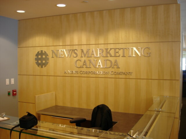
We love the bold yet refined choice of gold on gold for this office reception sign by AGC Signs. Gold has long been associated with prestige, quality, and success, making it a natural choice for businesses that want to project an image of stability and achievement.
In this design, sleek gold metal letters are mounted against a warm, golden wood-stained backdrop. The metallic finish catches the light, adding a subtle shimmer and sophistication, while the wood grain introduces natural texture and warmth. This pairing creates a balanced look—luxurious without feeling cold or overly formal.
From a psychological perspective, gold can convey both trust and high value, which is why it’s often used by premium brands, law firms, and financial institutions. When combined with the organic element of wood, the overall effect feels approachable and inviting, while still communicating authority and professionalism. It’s a reception look that will not only impress clients but also reinforce confidence in your brand before the first conversation even begins.
11. Mixed Metals
12. Backlit Beauty
Image Source: ODDNY
We love the layout and design of this gorgeous dental office by ODDNY. The backlighting on both the channel letters and the tooth image is particularly effective and inviting.
13. Classic Beauty
Image Source: AGC Signs
We love this choice for reception signage—a classic and professional design expertly crafted by AGC Signs. Here, sleek 3D lettering stands proudly against a backdrop of luxurious marble tiles, creating a look that is both timeless and striking.
The raised letters add depth and dimension, casting subtle shadows that change throughout the day as the lighting shifts. This dynamic effect keeps the design visually interesting while reinforcing a sense of permanence and quality. Meanwhile, the marble backdrop brings in a rich, polished texture that instantly elevates the entire reception area. Known for its association with luxury and tradition, marble communicates prestige and attention to detail—qualities that resonate strongly with clients the moment they walk in.
By pairing modern 3D lettering with the elegance of marble, this signage achieves the perfect blend of contemporary sophistication and classic refinement. It’s a style that works equally well for corporate offices, law firms, high-end retailers, or any business looking to make a memorable first impression that speaks of both success and stability.
For the Perfect Reception Signs and More, Trust AGC Signs
No matter what type of sign you’re looking for, AGC Signs can help you get the perfect sign for your unique business.
We are a full service signage company, which means we’re with you from the beginning until the end. We help you design, create, and install your sign and help with maintenance down the road.
We work with all types of businesses across Ontario including:
Grocery Stores
Local Trades
Educational Institutions
Government Offices
Medical Offices
Restaurants
Box Stores
Malls
Florists
Development and Real Estate Companies
And Any Other Business, Establishment, or Institution that Requires Signage
If you are ready to get the perfect sign for your business, contact AGC Signs today!
