Are you a business looking for a sign but don’t know where to begin? In this blog, AGC Signs will keep it simple and highlight 4 essential tips for signage design.
Here are our 4 tips:
If you have other questions about signage design, please contact us. We’d be happy to help you with your next signage project!
Learn some essential tricks of the design trade like using high-contrast colours.
Signage Design rules to follow
Don’t forget that AGC is a full-service sign company that offers design services. That means you don't have to worry about designing a sign on your own!
However, if you do want to come up with a design first, here are some important guidelines to remember.
1. Make A Good Impression
We all know the importance of making good first impressions, so put your best foot forward with your sign. Given that it's the first thing your customers will see, make sure your sign is:
Bold
Unique
Legible
Represents Your Brand
Now, let’s look at these points in more detail.
a) Be Bold
Being bold can be interpreted in a variety of ways, but what we mean is to have your sign stand out. The large bold font here can’t be missed. The yellow letters outlined with white borders make the letters pop. Even the name Fit 4 Less is a bold promise of getting in shape with less expense.
b) be Unique
You’ll want your sign to stand out from others, so think of a clever element to add. In the example here, Scholar’s has used a red apple instead of the letter ‘o’. Plus, the apple has a little maple leaf in it. This makes the sign more memorable and is a fun twist!
c) Keep it Legible
Look for a font that has clean or straight lines. Test out how legible your sign is from various distances. White/empty space around your font will help with legibility. While you can use a cursive font, don’t overdo it as it can be harder to read.
d) Represent Your Brand
Think through all that represents your brand: fonts, colour schemes, logos, slogans, etc.
Now make sure that these elements are included in your sign so that if you have signage elsewhere, you’ll end up with very consistent and cohesive branding.
Overall, you want your signage design to make a statement and draw attention. In other words, make sure it looks impressive and stands out.
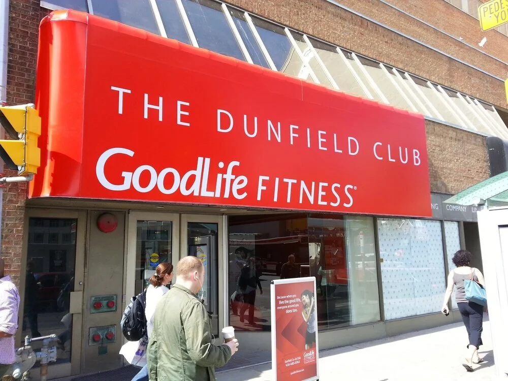
This sign’s white lettering is easy to read and the colour red grabs our attention.
2. Choose Colours & Shapes Carefully
Colour
For those familiar with marketing or design, you’ll understand that colour choices are thoughtfully considered. Here are 2 things to remember:
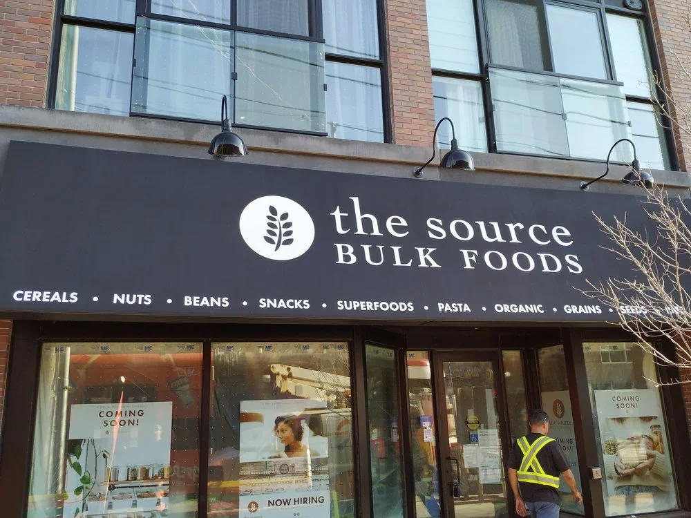
Choose colours that are high-contrast. Why? Because contrasting colours stand out. Scroll through the images we’ve presented in this blog post and you’ll see either light objects on a darker or coloured background or dark/coloured objects on a lighter background. This is done on purpose so that it is pleasing and comfortable to the eye. This is the contrast you want to have.
Think about what colours symbolize. Those yellow McDonald’s arches induce happiness and the red in the Goodlife sign makes us think of life and vitality. Think about what your business represents and who your target audience is and then think about what colours are suitable to that.
Did you know the colour yellow represents happiness and red symbolizes life?
Shapes
If you use shapes in your sign, make sure they are used intentionally and don’t interfere with the actual text and messaging of your sign.
For example, the red apple in the Scholar’s sign is subtle but intentionally sends the message of achievement and prosperity.
The circle replacing the dot in the ‘i’ doesn’t interfere with the message.
3. Use High-Quality Materials
Using high-quality materials matters, so work with a company that has good supplies and who can do a good job. Why? Because…
You don’t want to have your channel lettering fall off and give the wrong message
You don’t want your sign to fall down and become a safety hazard
You also don’t want to invest in repairs right away after installing your sign
You’ll also want to make sure your sign is appropriate for the weather in your area or for its use.
This brick monument sign is built to last!
For example, if you frequently experience high winds in your area, ask about the durability of your sign. If you are putting a sign outdoors, make sure the materials are weather resistant.
Ask a signage design expert if you are unsure about what type of sign to choose
Whether or not you are a business, consider your audience’s needs when you are selecting a particular style of sign.
4. Select a Style That Suits Your Needs
There are many signs to choose from (Click here to see a list of signs available from AGC). So, before you finalize your signage design, think about what style of sign is right for you.
For example,
If your hours include evening hours: Try a Backlit Sign which can be seen at night.
If you want your business site to be seen from the road: Try a Pylon or Monument Sign.
If you want to show custom information: Try a Custom Sign with electric/digital displays.
If you live in a climate where rain and snow are often experienced, consider an Awning Sign.
If you are unsure about the options available, contact an expert at AGC Signs. You can also browse through our gallery to get some inspiration. Or have a look at our other blog, 15 Awesome Signage Ideas.
You can trust AGC Signs for everything from signage design to manufacturing and installation!
Signage Design With AGC Signs
We’ve enjoyed providing some helpful tips for fellow designers like you! But remember, if you do need professional signage design, advice or other signage services, AGC Signs is happy to serve you.
Working in Pickering and the GTA, AGC is a sign company that comes highly recommended by its clients for their quick responses, customer care, and high-quality signs.
With over 10 years of experience in the sign industry, you can count on AGC Signs for all your signage needs. They offer the following signage services:
Read our blog for other helpful tips or read our testimonials to learn more about our successful signage projects. Also, don’t forget to contact us to speak with someone directly!
““I worked with AGC Graphics on a signage project and was really happy with how it turned out. Rhonda took the time to explain to me how everything works and we went back and forth a few times looking at proofs. She was super helpful and I’m really happy with the quality of work I received. Would definitely recommend!””


