Chances are that if I asked you to imagine an exciting sign, you’d come up with an image of the iconic Welcome To Las Vegas sign or the storefront sign of your favourite restaurant. In this blog, AGC Signs will highlight 10 awesome outdoor signs for businesses and then explain why they stand out.
Click on each link to jump ahead:
You’ll see signs from well-known brands and others signs from brands you’ll want to learn more about - either way, we’ve got some inspiration for you as you think about your next signage project!
Design your next outdoor sign with AGC Signs!
Design Tips: Outdoor Signs For Businesses
1. McDonald’s
Image Source: Matheus Bertelli
These golden arches appear everywhere - even overseas. The McDonald’s sign is so popular that you don’t even need to see the name of this fast-food chain to recognize it, just that yellow “M”, one of the most iconic brand symbols.
Why do we like it? Well, the colour yellow induces positive feelings and perhaps the “M” makes us think “Mmm”. Plus, the usual pylon signs McDonald’s uses help drivers find their upcoming meal!
Takeaway: Consider what associations you want clients to make with the visual representation of your brand (letters, symbols, colours).
2. Nike
Image Source: Mathias Reding
Like McDonald’s, Nike doesn’t even need to write its name on its storefront to be recognized because the symbol is so well-known. In this example, it is proudly lit up in this downtown windowfront.
Its white colour contrasts against its dark backdrop at night and the fact that it is illuminated means it comes with digital controls allowing you to turn it off after a certain time. You may even be able to control its colour intensity or brightness as the day fades. Lighting is an important factor to consider in outdoor signs for businesses.
Takeaway: Use highly contrasting colours in your storefront sign, preferably light on dark.
3. Scholar’s
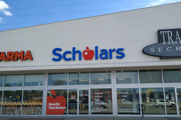
This storefront sign may not be as recognizable as McDonald’s or Nike’s, but it is attractive and stands out. Why? Because of the following:
Its clear and legible font
The clever use of the apple with the maple leaf for the letter ‘o’
The use of high-contrast colours, this time dark or bright lettering on a light background
Again, the brand is represented by colours we associate with positive things. The red apple hints at happiness and success while the blue lettering creates a feeling of calm and security. We also come to expect that this company understands the Canadian education system given the maple leaf.
Takeaway: Use clever elements in your sign like the apple here. People will appreciate it and your sign will be more unique and memorable.
4. Custom Digital Signs
While this sign is for a school that really only locals would know about, this is a great outdoor sign. It is a customized monument sign with digital controls.
First, the white lettering of the school name and address stands out against the dark and coloured backgrounds and ensures the school is recognized.
Second, the digital display of information at the top is helpful for families that attend the school and administrators can easily program and adjust it accordingly.
Takeaway: Decide what messaging you might require and if digital customization would enhance your communication with clientele. Customization is a great option to consider when designing outdoor signs for businesses.
5. Backlit Signs
This sign is really classy! Why do we say that?
It has sleek lettering
There is a high contrast between the black lettering and the white background light
The soft glow surrounding each letter makes them pop!
While this sign could be used outdoors or indoors, a backlit sign like this is ideal for ensuring that your business gets recognition day or night.
Takeaway: The lighting and font style really makes this sign stand out. Test out different font styles and lighting together when designing outdoor signs for businesses. Learn other signage design tips in our blog, Essential Design Tips.
6. Circular Signs
While most signs are rectangular in their layout, this sign is a circular shape which makes it stand out in a more subtle way. It is neat and tidy with a combination of bold and straight-edged font taking up the majority of the space and some cursive font above which emphasizes that this is THE place to hang out with friends and enjoy pub fare.
Also, note that the awning displays the restaurant name on the side for anyone viewing from a different angle
Takeaway: Don’t forget to coordinate your signage and make it consistent. Also, don’t be afraid to try cursive font - just make sure it is very legible.
7. Tiffany & Co.
While this company may not have iconic symbols as part of its brand, here we have another storefront sign that is well-known. Why place this storefront sign among our top outdoor signs for businesses?
It has an elegant font, so we’d expect them to specialize in fine products
The snowflakes are golden, so we think of precious metals
This storefront sign can be seen at different angles and from various distances - from far away or from close up
Again, we see the white letters on a dark background, but there is just enough dark background to make the letters stand out. Otherwise, the actual border is white. Everything is light and sparkly - a perfect display for the holidays.
Takeaway: Add special signage displays to create a festive feeling and don’t forget to make sure your sign can be seen from different locations and angles.
8. Goodlife Fitness
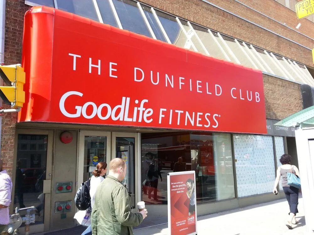
This sign may be another one that is recognizable to many of us. Whether or not you recognize it though, it stands out to onlookers because of its clear channel lettering.
Channel letters are a type of 3D lettering which are mounted separately on a background. They come forward and literally “pop”.
Why are channel letters an exciting option?
They are stylish
They are highly customizable
They are versatile and can be coordinated easily with interior or wayfinding signage throughout your business.
For more information about channel letters, read our blog called 3D Letter Signs: Everything You Need To Know.
Takeaway: Learn about current signage options before finalizing your signage design.
9. Awnings
While this sign may not be as exciting as other outdoor signs for businesses, we are including it because it is a unique way to advertise your business. Plus, you’ll also:
Make good use of unused space
Provide shelter to clients who may be out in the rain, snow or sun
Stand out among other storefront signs which tend to lay flat against the storefront wall
We can say that the background colour of red does create some excitement as we normally associate red with feelings of passion, excitement or vitality.
Takeaway: Carefully consider how you can make use of space with your signage. Think about depth, size and even function.
10. Fun Custom Banners
Lastly, we want to give you another exciting idea for those considering outdoor signs for businesses: the custom banner.
This custom banner has been designed as a complement to the main storefront sign. It has been installed on the outer wall and shows the Jollibee mascot and slogan.
While the name of this fast-food chain itself creates feelings of joy and merriment, this little bee welcoming guests is just too cute and definitely makes guests feel warm and fuzzy, especially kids!
Takeaway: Create excitement with custom banners that can be adapted to various seasons, promotions and purposes.
Outdoor Signs From AGC
AGC Signs has designers ready to help you with your next signage project. Get professional design advice, manufacturing and installation. As a full-service signage company, we even do repairs and maintenance. See our gallery of exterior signs here.
We are proud to serve Pickering and the GTA and we have made it our goal to help you get noticed!
Contact AGC Signs today to design an exciting outdoor sign for your business!
“AGC Graphics was a pleasure to deal with. They were clear in communication, quick to book a date to measure, gave tons of options, and followed up as it was required but above all else, their price was so competitive. I am beyond happy with my new sign and I love it. I’ll have AGC Graphics do my exterior sign next on my building. Very satisfied with their team and would recommend without question.”


