People like clear directions and what better way to direct them than with wayfinding signage? In this blog, AGC will provide some pointers for creating effective wayfinding signage so your clients find your business and the products or services they want quickly and easily.
Click on any of the 6 tips to jump ahead:
1. Create Text That Stands Out Clearly
If you have questions about wayfinding signage or any other professional signage, contact AGC Signs.
Ensure you can be found with effective wayfinding signage.
(Image Source: Tim Mossholder)
Top Tips For Effective Wayfinding Signage
1. Create Text That Stands Out Clearly
If you have clients coming to your office or your location at a shopping centre or a community building, you’ll want clear wayfinding signage. To ensure your wayfinding signage stands out, consider the following elements:
Colour
To make text stand out clearly, use dark text on a light background - just like you see in our titles and headers. Colour Theory suggests that we use high-contrast colours if we want our message to stand out, so you can try other colour combinations. You’ll see white text on a dark background or certain colours like blue.
Font
Another thing to consider is the font. A highly cursive or decorative font is harder to read than a font with clean and straight lines. You might want to embellish your text, but make sure it isn’t distracting the reader from the actual message. Before you finalize your signage, test out different colour and font combinations so you can see what stands out the best. Here are some font ideas.
White Space
Also, be sure that there is enough white space (the empty space that surrounds your text and/or graphics) so the sign is easy to read and is not too busy-looking. If you cram too much into your space, the message can get lost and buried.
Don’t forget to have someone edit your signs before manufacturing them.
(Image Source: George Becker)
2. Edit Your Text
Although this may sound obvious, you must make sure to edit all the text in your wayfinding signage. Consider the following:
Spelling Mistakes
Grammatical Errors
Visual Imbalances in Design
Also, let others give you feedback; don’t do all the editing yourself. Sometimes we can look at something for so long that we don’t even see the obvious mistake in front of us. We just get so used to seeing something a certain way.
You may even discover that someone understands your messaging differently than you expected. Remember, while there are standard ways of communicating, not everyone thinks alike.
Directional symbols like arrows are helpful in wayfinding signage.
3. Use Arrows & Indicators
There may be areas in your commercial building where using arrows or other indicators and symbols may be helpful. You’ll often see the following types of indicators in wayfinding signage:
Directional Indicators (E.g. Arrows, Stairways Up or Down)
Accessibility Indicators (E.g. Wheelchair Accessibility Symbol)
Safety Indicators
Warning Indicators
There are lots of symbols you can add along with text to better get your message across, but make sure you use them consistently and place them where they are visible.
Colour codes can be used as an effective and memorable legend.
4. Add Maps/Legends
To help people get a better sense of the surroundings upon entering your place of business, you can include maps, legends or other large overview panels in your wayfinding signage. This helps highlight the different departments customers might access.
These are ideally placed in high-traffic areas so people can find where they want to go next upon their arrival or departure from one place to the next.
You can also use the “You are Here” phrase and pin symbol so people have a reference for where they are in relation to the bigger context.
Signs that have additional room for added information offer you flexibility.
5. Consider Long Term Needs
As your business grows and changes, so will your wayfinding signage. Consider using signs that have replaceable text or a design that gives you the option to adjust information.
As staffing changes or locations change, you’ll want to customize your signage appropriately. Therefore, opting for signage where you can slide out one component and add another is a great idea. For instance, in the picture above, you’ll see that this sign has plenty of space for adding the names of new offices.
Let our trained designers at AGC help you create effective wayfinding signage.
6. Go Pro!
For the most effective wayfinding signage, hire a professional sign company like AGC Signs. With their keen eye for design and manufacturing equipment, AGC provides you with high-quality and long-lasting products. They also design signs that grab the attention of your clients and communicate with them effectively.
Click here to contact us, or keep reading to learn more about AGC.
Professional wayfinding signage starts with professional design.
Wayfinding Signs From AGC
If you have a large business or office area that is challenging to navigate, AGC can help you design and install wayfinding signs. Consider the following types of signs:
Welcome Signs
Washroom Signs
Directional Signs
Room Signage
Safety Signage
And more!
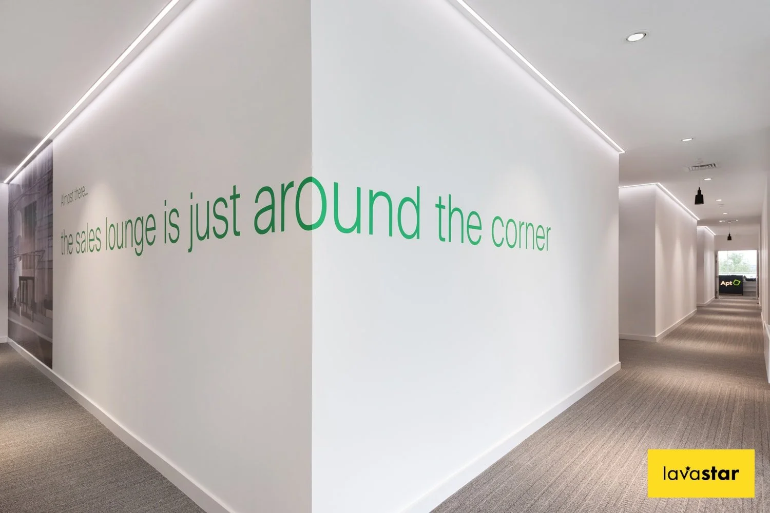
You may even have your own creative idea for a wayfinding sign. We’ve seen clever signs that communicate messages on corner walls like this one above and in between stairs. You can have a little fun with wayfinding signs!
AGC Signs has been servicing customers in Pickering and the GTA for over 10 years and have many happy and loyal customers. Click on the link here to see a gallery of our work or read our testimonials. We can help you with your next signage project!
“I have been working with AGC Graphics for many years and it’s been a pleasure. Great team, Great Service and Great Work.”
“They have always been wonderful to work with. I was first referred to them by another happy customer of theirs as I was planning to open my own office. AGC’s designer worked with me and the customer service rep to create my business logo, letterheads, business cards, and the large signs outside the office. From the designing, to editing, making and printing, and sign installing... Everything was done in a timely manner and they were so professional to work with.
Every year or two, I reach back out to make a small order here and there, and they are always ready to help. Strongly recommend them! Thank you Adrian and Rhonda!”


