Today we are going to show you some of the best examples of outdoor business signs.
We've been in the custom sign business for over 10 years and we'd love to share our expertise with you.
We'll show you 10 examples of the best outdoor business signs to help inspire you to design your own. Let's get started!
Outdoor Business Signs
1. Creative Name
A great name can make for an even greater sign - Source: Pinterest
If you have a creative name for your business like this bookstore called “As The Plot Thickens” we found on Pinterest, then use that to your advantage when designing your outdoor business signs. If you didn’t get from the name that this was a bookstore, then the image at the top would definitely help.
The whole sign looks like it could have come straight out of a Dickens novel and it is so intriguing that it would make any reading enthusiast want to discover what other cool treasures are inside!
Takeaway: Think of a creative name that will make your business memorable
2. Symbolism Is Everything
You can’t miss the meaning of this sign - Source: Pinterest
Great outdoor business signs use great symbols and here’s a sign with a perfect symbol. You can’t misunderstand that you are going to get to eat at this business, even if you weren’t able to read the actual lettering - but you are able to very clearly read the lettering in this sign. It’s big, bold, and highly legible, and that’s why this over-the-top cafe sign makes our list.
Takeaway: Use symbols that effectively represent your business
3. There Are No Words - Literally
A tilted martini glass can be worth a thousand words
- Source: fineartamerica
There are no words for this sign - literally. The picture is worth a thousand of them There is absolutely no doubt about what you will be able to buy underneath this tipping glass-shaped three-dimensional neon sign from fineartamerica. It’s actually quite a work of art and its attractive luminous colours will certainly get your potential customers’ attention.
Takeaway: The right image can effectively replace text
4. A Sign to Reflect Your Image
Your business sign should reflect your image - Source: Behance
This sign for Clover Park Technical College does a fantastic job of reflecting the technology curriculum for the school. It incorporates sculptural design elements in striking layers and complementary materials. It's clear, eye-catching, and actually quite beautiful to look at. You would want to attend a college that produces work like this!
Takeaway: Think carefully about all parts of your design so it perfectly reflects your image.
5. If You Have 2 Faces, Use Them
Make the most of every visible side of your building - Source: AGC Signs
If your business is lucky enough to have more than one wall facing the public, make the best use of it as GoodLife Fitness has done above. Attaching outdoor business signs to both the side and front faces of your building means you can attract the attention of more people passing by.
This sign also works well because of the clever colour choices. White channel letters stand out beautifully against the brown bricks on the building.
Takeaway: Take advantage of every side of your building.
6. A Sign that Works Like a Wall
This double-duty cafe sign is extremely clever - Source: DeviantArt
This is one of the cleverest ideas for outdoor business signs - making your sign act as a wall around your cafe’s patio. The bright bold lettering immediately grabs your attention and the ingenious way this type of signage wraps around its customers is so cool.
Even the large cup of coffee seemingly spilling over into the street does a great job of catching your eye!
Takeaway: You sign doesn’t always have to be attached to a wall, it can also be the wall!
7. Simple but Effective Symbol
Source: Creative Maxx Ideas
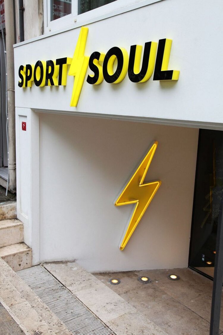
This sporting goods store sign from Creative Maxx Ideas has done a great job in choosing an appropriate and effective lightning bolt symbol to give you a sense of speed - a very good quality for most sports.
In addition, the choice of highly contrasting black and yellow colours for the channel letters make it very easy to read and really pop against the white background of the entrance.
Takeaway: Make the best use of simple symbols and contrasting colours.
8. Light the Way to Your Store
Lighting makes your outdoor business signs more legible - Source: AGC Sighs
Illuminating your outdoor business signs makes sure that they are easy to see but also easy to read. Lighting is not only helpful at night, but it will also be beneficial if your sign is located in a darker area or in shadows.
The illuminated channel letters above for the Pet Smart sign are also brightly coloured, making them stand out against the darker colour of the building.
Takeaway: Illuminate your sign for better visibility.
9. Complement Your Architecture
Make sure you sign doesn't take away from your architecture - Source: Trendhunter
If you have a great building, show it off. The unique design of this seaside cafe in Manchester, UK, is alluring enough that it doesn’t need an overpowering sign.
The simple yet chic lettering on this outdoor sign cleverly integrates with the architecture and doesn't take anything away from the building itself. It actually helps to enhance the idea that this is a cafe that you will want to try out. It tells potential customers that it's distinctive, modern, and hip.
Takeaway: Choose a design that will match your architecture
10. A Simply Effective Sign
A simple message with a powerful graphic - Source: Cubicle Refugee
We love how this clever sign drips onto the front window. It’s a simple design yet it leaves a very powerful impression. The use of one colour beautifully painted onto the brights and window wonderfully highlights the business name “The Green Painter”.
It’s simple, yet very effective and gets the exact message across about what they do with very few words and a basic graphic.
Takeaway: Make your signage simple, yet evocative.
AGC Signs - Trust Us to Make Any Type of Sign You Need!
You can trust AGC Signs to manufacture and install any type of outdoor business signs you require. We have over 10 years of experience in the custom signage industry in Ontario.
We strive to exceed industry standards by providing our clients with superior signage solutions through in-house custom design, fabrication, and installation.
We can help you consider all factors involved in the creation of your outdoor business signage, including structural requirements, municipal by-law requirements and permits, as well as the architectural features of the building where it will be located.
All of our technicians are highly skilled and extremely hard-working and we use only top-of-the-line equipment. You can trust us to do the job right; we do all of the work ourselves and never subcontract it out. Contact us today for a quote.
"I worked with AGC Signs on a signage project and was really happy with how it turned out. Rhonda took the time to explain to me how everything works and we went back and forth a few times looking at proofs. She was super helpful and I'm really happy with the quality of work I received. Would definitely recommend!"
- Lisa Ng
Read more Reviews


