Storefront signs are important for many reasons - exposure, branding and aesthetics to name a few. It's often the first impression visitors will have of your business, so it's crucial to have a carefully crafted sign in place. In this article, we will talk about seven key elements you should consider when designing storefront signs and what you should avoid.
Overwhelmed by the design elements of storefront signs? You can trust AGC Signs to design, manufacture, and install any type of signage you require, including storefront signs that will help you build your brand.

Storefront signs can be a great marketing aid if designed well.
Storefront Signs - Keys to a Successful Design
1. Make Sure It's Legible
You need to make sure that people can read your storefront signs. This may seem like an obvious point, but too often businesses have designed signs with unusual and extremely fancy fonts that may look beautiful but are almost impossible to read.
While it's great to have a sign that customers will think is beautiful, the sign will be practically useless if they can't understand what it is saying.
Here are some important tips to make sure that your sign is legible:
Make sure you choose an easy-to-read font
Stay away from elaborate cursive fonts
Make sure the lettering is well-spaced and not overlapping or too crowded.
Don't overuse capital letters - Sentence or Title case is actually easier to read than ALL CAPS
Leave enough space between words and images
If you want your sign to be read by passing traffic, it will need to be read in just a few seconds.

Storefront signs should have an easy-to-read font.
2. Use Colours for a Purpose
Your choice of colour for your storefront signs will play a huge part in the success or failure of your sign. Colour has a great effect on people's behaviour and decision-making.
According to Small Biz Trends, "93 percent of buyers said they focus on visual appearance, and close to 85 percent claim colour is a primary reason when they make a purchase!"
Different colours evoke different reactions from people.
Red: This popular marketing colour stimulates your body and raises your blood pressure and heart rate. Red generates a sense of urgency so many businesses use it to promote sales. It also makes you hungry, so you will often see it used at fast-food restaurants.
Blue: Men actually prefer the colour blue. It gives a sense of peace, security, and reliability. It is a good colour to use if you have a conservative brand and you want to promote trust in your products.
Green: This is a very relaxing colour and is often used to promote environmental products. It gives a sense of health, tranquillity, nature, and harmony.
Orange and Yellow: These are very bright and cheery colours. They give a sense of optimism. Even though orange can give off a sense of caution, it can also create anxiety which works on impulsive buyers and window shoppers to get them to buy.
Black: Black should be used sparingly as it can become overwhelming. However, if used in the correct balance it can symbolize intelligence, authority, power, stability, and strength.

Red promotes sales, blue builds trust, and black shows stability - a good choice for a real estate company.
3. Contrast Will Make Your Sign Easy to Read
It is important for your storefront signs to have the right amount of contrast between your letters and background colours.
Dark backgrounds with light coloured text or light coloured backgrounds with dark text will stand out the best. Avoid using colours that are close together like white text on a beige background. This combination will be almost impossible to read on a sunny day.
Putting a border around your text or graphic can increase the speed which you can read it. If you want to have colours that are closer in colour for your background and text, then adding a drop shadow or an outline to your lettering will make it stand out much better.
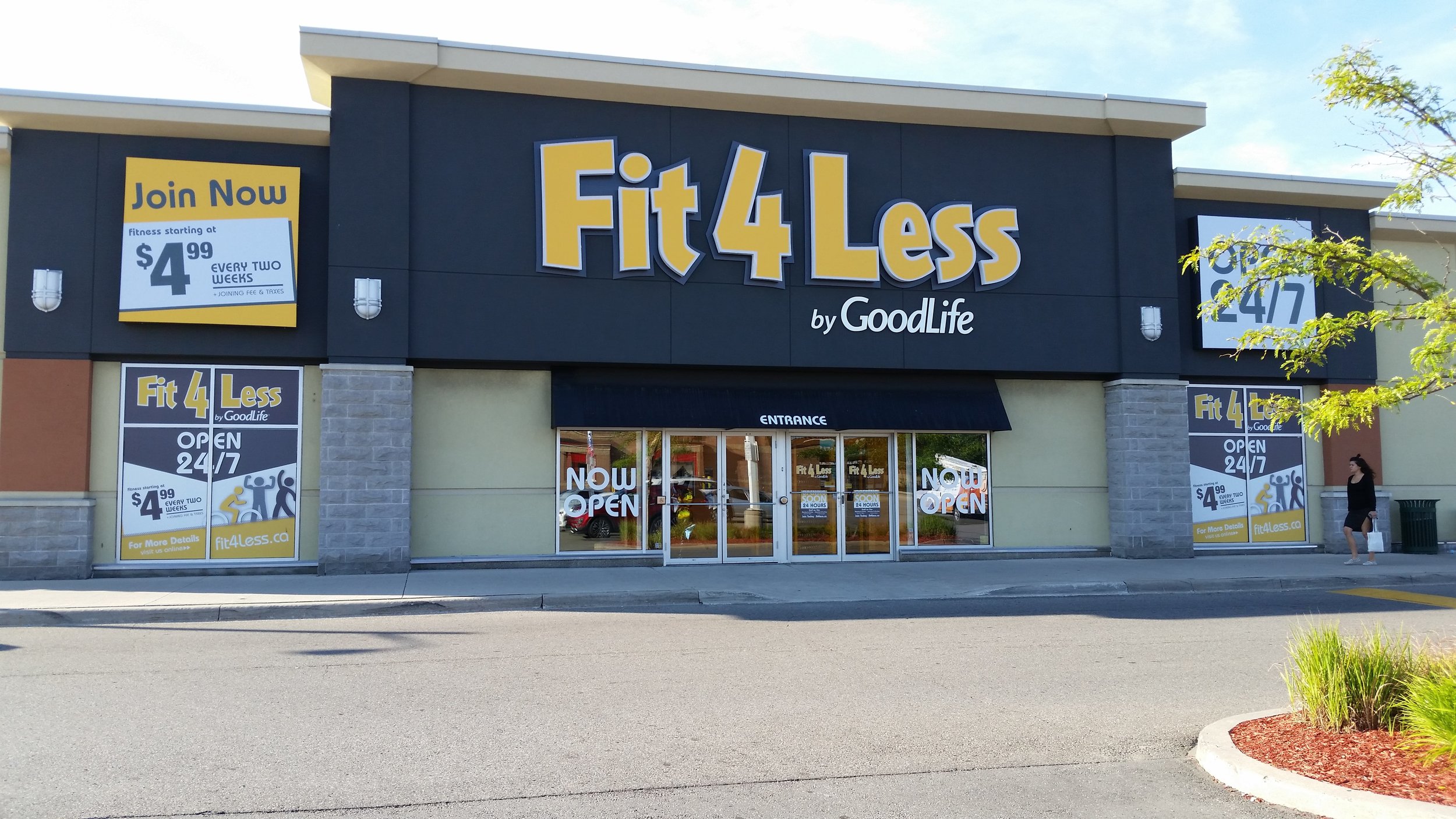
The dark blue background with yellow letters with a white border offer good contrast for reading.
4. Make It the Right Size
With storefront signs, size really does matter. Larger letters are just easier to read. If you want your storefront signs to be seen from a greater distance, make them as large as possible.
According to entrepreneur.com, "a good rule of thumb might be 10 feet per inch of letter height." This means that if your text is 20 inches high then it can be viewed from 200 feet away.

Make your lettering large enough to be read from a distance.
5. Make It Stand Out
When you are designing storefront signs, you need to think about what other signs are going to be close by. You don't want your sign to blend in; you want it to stand out among the competition.
For example, if your business is next door to one that has a blue sign with white lettering, you should go with a different colour combination so that you stand out.
Illumination is another way to make your sign out, especially if the signage around you isn't lit up. A professional custom signage company will be able to give you great ideas for designing your sign to make it stand out.

Illumination can help make your storefront signs stand out.
6. Make It Represent Your Style
The right storefront sign design can reflect what your business is about in a matter of seconds. Your business is unique, so you want to make this uniqueness come out in your signage. Your sign needs to attract peoples' attention and draw in potential customers.
Make sure that you invest in a quality sign that best represents your business and gives off a great first impression. A poorly designed and low-quality sign can actually turn people away and dissuade them from even coming into your establishment.

Invest in a high quality storefront sign.
7. Make Sure It Lets Customers Know What You Do
Unless you are a major brand that is easily recognizable with one word like "Guess" or "Starbucks," your storefront signs aren’t the place to take a minimalist approach. Your signage will have a greater effect if it gives a potential customer an idea about what you do.
You still need to keep the message short and sweet to make sure that it can be read quickly, but it should also tell passersby exactly what you do.
For example, a graphic such as a steaming cup for a coffee shop or a loaf of bread for a bakery can give a good clue to what your business is about and will be more effective in attracting new business.

You signage should quickly tell customers what you do.
Get the Exposure You Need with AGC Signs
If you are looking for storefront signs that will get your business noticed and give you the exposure you need, contact the professionals at AGC Signs.
We strive to exceed industry standards by providing our clients with superior signage solutions through in-house custom design, fabrication, and installation.

We can help you consider all factors involved in the creation of your signage, including structural requirements, municipal by-law requirements and permits, as well as the architectural features of the building where it will be located.
All of our technicians are highly skilled and extremely hard-working and we use only top-of-the-line equipment. You can trust us to do the job right; we do all of the work ourselves and never subcontract it out. Contact us today for a quote.
Customer Testimonials
“We found AGC Signs thanks to positive Google reviews, so now we’re paying it forward - we truly enjoyed working with Adrian and Rhonda and are extremely happy with their quality of work and customer care!”
“I have recently installed Plexi glass barrier for my company. Excellent customer care service by Rhonda and Adrian. Very good Prices and professional work in timely manner.”


