In this post, we're going to take a look at restaurant signs and how to make the most of them.
We've been in the custom business sign industry for over 10 years and we'd love to share our expertise with you.
We'll provide you with helpful tips and tricks that will help you design effective restaurant signs to attract attention and increase your traffic. So, let's get started!
Fast food restaurants use red and yellow for faster traffic turnovers
Restaurant Signs Can Help You Build Brand Awareness
Restaurant signs are great at building brand awareness, so make sure that you design a sign that is going to help your customers easily identify you.
Keep your exterior and interior restaurant signs consistent with matching colours, fonts, and graphics to help build your brand. Take advantage of takeaway containers and bags to also display your brand.
Colours: Choose colours that best represent who you are. If you are upscale, then you should avoid bright or neon colours; if you are a family restaurant, then brighter colours may be a good choice.
Fast food, casual, and buffet restaurants often choose a warm colour palette that incorporates reds, oranges and yellows.
These colours give visual stimulation that helps increase your turnover rate. More subdued colours are best for upscale dining where you are encouraging your diners to take their time.
Your restaurant signs should let your customers know what your restaurant is like
A Good Restaurant Sign Will Give Your Customer an Idea of What They're in for
Depending on the type of restaurant you have, there are many different ways that you can use your signage to display your personality and give your customers a sense of what your restaurant is about and what they can expect.
Up-Scale: If your restaurant is a more up-scale establishment, you probably want your sign to look simple and classic. Use clean lines and few words. You probably won't want to have any pictures or elaborate logos on your signage.
Fun: If you want to portray the idea that your restaurant is a fun place to visit, try incorporating humour into your restaurant signs. Playful illustrations, cartoons, or logos can also help give the sense of fun.
A playful sign can give the impression that your establishment is a fun place to visit
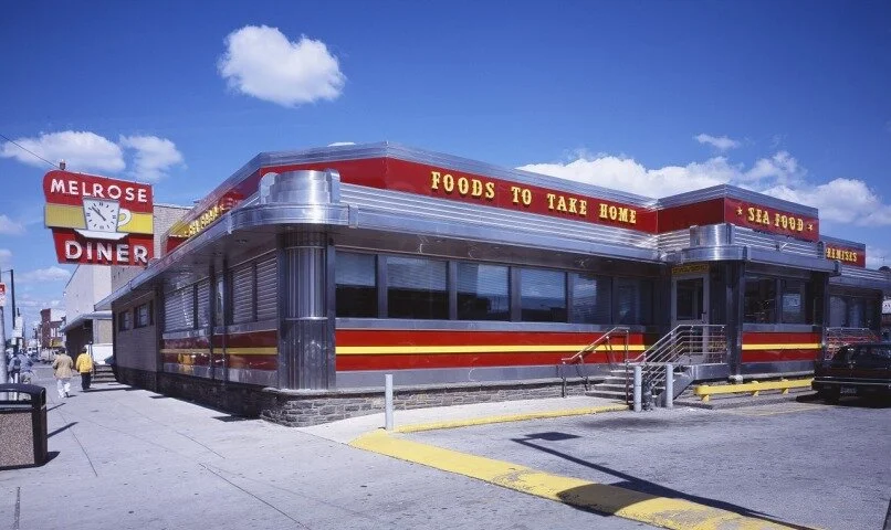
Retro: If you want to let your customers know that your restaurant is a throw-back to the diners of the 50s and 60s, choose a sign design from that era. You might even consider installing a neon sign.
Pub Feel: If your restaurant has an old-world pub theme, choose a sign that depicts that era so you customers will know what to expect.
Exterior Restaurant Signs
Corners: If your restaurant is located on a corner, make sure you use this to your advantage and place signage on every side of your building.
Illumination: Illuminate your sign so that it can be seen at night or if the lighting around your restaurant is poor. LED signs are a good choice because they actually glow brighter than traditional lights and they use a lot less energy. Another option is to use overhead or back lighting to make sure that your sign is visible.
Movement: You can catch people's attention if your sign moves. This can be achieved by installing a digital sign that changes its message or images every few seconds or by getting a lighted sign that alternates between different coloured text.
Place restaurant signs on all sides of your building
Interior Restaurant Sings
Menus
Your menu is a very important part of your restaurant signage. It is a great advertising tool that if done well can drive sales and enhance your brand awareness and identity. Restaurants display their menus on menu boards, printed menus, chalkboards and tablets.
Menu Boards
If you have a menu board, make sure that the lettering is:
Large Enough: A good rule of thumb to follow is to make your lettering 1" high for every 10 feet away your viewer is for easy reading. So if your customers will be standing 20 feet away from your menu board, your letters should be 2" high.
Legible Font: Choose a font that is easy-to-read and not too curvy or fancy.
Contrasting Colours: The colours of the letters on your menu board should contrast with the background so that they stand out. Use a dark background with light letters or a light background with dark letter. For example, yellow letters on a blue background or white letters on a black background work well.
Make the lettering on menu boards large enough so your customers can read them easily
Printed Menus
Use Sections: Try to divide your menu into logical sections: appetizers, side dishes, main courses, drinks, desserts, etc.
Pictures: If you are a high-end restaurant, you probably should use pictures sparingly. Not every picture will appeal to every customer.
Illustrations: Illustrations on your menu can often be more effective than pictures and can really display your restaurant's personality.
Currency: Consider leaving out the $ signs. Studies have shown that people will spend more if the menu doesn't have the currency sign on it or if it’s less obvious.
Make the currency less obvious: omit the currency signs to encourage customers to buy - Image Source: Behance
Chalkboard Menus
A trend today, especially in cafes, is to hand write the menu on a chalk board. If you choose this type of signage, make sure you use a template to make it look professional. The following video will show you how.
Be sure to use a template to make your chalkboard sign
look professional
AGC Signs: For the Best Restaurant Signs in Toronto
If you need custom made restaurant signs in Toronto, contact AGC Signs. AGC Signs can help you design and will manufacture any type of signage you require, for outside and inside your establishment.
We have over 10 years of experience in the signage industry in Ontario, so we can help you design the perfect sign.
We strive to exceed industry standards by providing our clients with superior signage solutions through in-house custom design, fabrication, and installation. We do it all from start to finish - that’s why AGC Signs is your one-stop signage destination.
We can help you consider all factors involved in the creation of your signage, including structural requirements, municipal by-law requirements and permits, as well as the architectural features of the building where it will be located.
All of our technicians are highly skilled and extremely hard-working. We also use only top-of-the-line equipment. You can trust us to do the job right; we do all of the work ourselves and never subcontract it out. Contact us today for a free quote.
"AGC Signs was absolutely professional in all aspects. Their work is exemplary, and their customer service is fantastic. I would highly recommend AGC Signs to anyone looking for quality work and service."
- Mike C
Read More Reviews


