Today, we’ll take a look at 16 awesome restaurant sign ideas to help you get inspiration for your own building.
In this article, we will showcase a variety of different restaurant sign ideas and outline why they made our list.
1. Exterior Signage to Attract Foot Traffic
2. Functional Signage That Also Markets Your Menu
3. Design-Driven Brand Expression
At AGC Signs, we’ve helped restaurants all over the Durham Region get the signage they want, and we’re here to help you get ideas for your own project!
1. Exterior Signage to Attract Foot Traffic
bright & fun signage
When your brand is all about fun, your signage should be too!
This Menchie’s Frozen Yogurt sign is a perfect example—bright pinks, bold lettering, and playful design elements come together to create a sign that’s as inviting as the treats inside.
Paired with a whimsical logo and eye-catching font, it turns the storefront into a visual celebration of flavour and joy.
Bright and fun signage like this doesn’t just get noticed—it sets the tone for the customer experience from the moment they arrive.
Rustic hanging sign
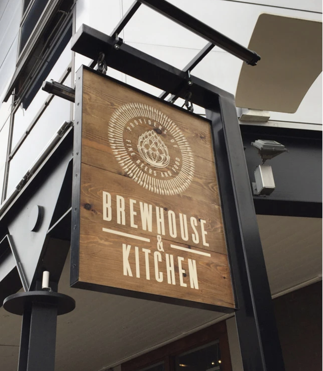
Hanging signs are commonly used outside of restaurants and cafes. They’re often found in a rustic style, reminiscent of pub and bar signage of the past.
This awesome sign is both rustic and modern, and uses mixed materials (metal and wood) to create a truly unique design.
elegant iron sign
Image Source: Inspirationfeed.com
This beautiful metal sign shows that even a small and simple sign design can be packed with creativity.
You may want to include something like this on the side of your building in addition to your main logo or storefront sign.
This elegant sign even contains a place at the end for hanging flower baskets, and would definitely look even better in the spring and summer.
a Blast from the past
Image Source: Thecarvingcompanyonline.com
Many restaurants have a theme, and if you are looking for something a bit “old-fashioned” for a pub or bar, then a classic wooden sign like the one above might be the best choice for your business.
simple lightbox sign
Image Source: Goodwinandgoodwin.com
A lightbox sign can be used inside or outside your store, and can bring a bit of a retro look and feel to your restaurant. Custom-made lightbox signs can include your logo and unique font choices and even images and icons.
multiple signage
Some restaurants are located as part of a larger building, such as small restaurants and food establishments that are part of strip malls.
If that’s the case, you can use a combination of storefront signage, banners, and window signs to make sure guests know exactly where your store begins and ends.
8reclaimed wood sandwich board
Image Source: SouthernOakStudios on Etsy
Our list wouldn’t be complete if we didn’t include a sandwich board sign! This style of signage can be a great addition to your restaurant, especially if it’s located in an area with lots of foot traffic.
Your sandwich board sign doesn’t have to be boring - the one above includes wood, metal, and a chalkboard!
Vintage Sign Design
Image Source: RetroRoadsidePhoto on Etsy
There is something nostalgic about retro signage - even if you haven’t seen many of these signs in person! These retro designs are definitely making a comeback, and we can get a lot of inspiration from the colourful, bright, and unique restaurant signs of the past.
2. Functional Signage That Also Markets Your Menu
interior banners
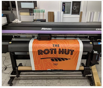
Looking for signage that makes a statement before customers even walk in? This banner for The Roti Hut shows how it's done—high-contrast colours, dynamic typography, and simple, strong branding.
Whether it’s used for grand openings, street festivals, or just everyday visibility, a bold vinyl banner like this delivers maximum impact with minimal fuss.
It’s proof that vibrant design and strategic simplicity can work together to make your restaurant unforgettable.
exterior menu
Planning to list your menu outside your restaurant? This classy lit-up corkboard sign allows for you to easily swap out menus and additional information. It also includes the name of the restaurant right above. It’s a simple yet bold design. If you’re looking for great restaurant sign ideas, definitely add this to your list.
creative menu
Signage can act as more than just customer information - it can even be a work of art! This restaurant displays its menu on nearly an entire wall in a fun and unique way. If you are looking for an interesting way to show off your menu, take notes from this sign design.
intricate wall signage
Signs help with your overall restaurant branding. It’s important to remember that signs are not just storefront signs - wall designs, murals, banners, and window decals are all forms of signage! This amazing, intricate wall sign art is the perfect example of how you can incorporate signs into your design and accentuate your brand.
3. Design-Driven Brand Expression
Logo Within Lettering
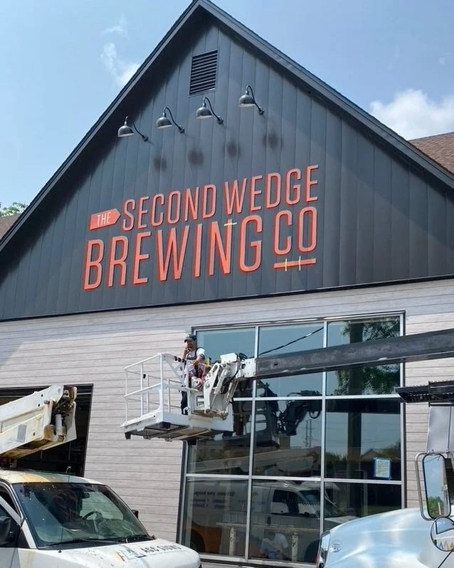
With a large gable wall to work with, The Second Wedge Brewing Co. made the most of the space by using bold, eye-catching lettering—and a subtle visual twist.
This clever design incorporates the logo right into the name of the brewery.
If you’ve never heard of them before, the small wedge shape replacing the crossbar in the letter “E” is a creative nod to the name and brand, giving passersby a memorable visual cue that ties it all together.
modern lettering
Modern lettering placed among a rustic backdrop - this is a great example of how mixing different styles can create a look that really “pops!” If you have a unique building, consider how your lettering and logo will look against it, as it will act as the background to your signage.
unique materials
Image Source: Athoughtforfood.net
If you’re looking for creative restaurant sign ideas, this one should definitely cover a lot of bases. It’s a good reminder that when it comes to signs, you can really think outside the box!
fancy font choice
The font you choose for your restaurant sign will have a big impact on the look and feel you convey to your customers. Take a look at this beautiful sign above! Without the unique font choice, this sign may not have been much to look at, but a great combination of fonts, colours, and imagery helps it stand out.
Need More Restaurant Sign Ideas?
At AGC Signs, we can help you get the perfect restaurant sign you’ve always wanted. If you need more restaurant sign ideas, contact us today.
AGC services the Durham Region and the Greater Toronto Area - but we also service customers in the U.S.
“Very happy with customer service provided for my business. Fast service from skilled individuals who perform a wide variety of jobs related to my graphic and printing needs. Would gladly recommend.”
